 |
|||||
| For Your Consideration:
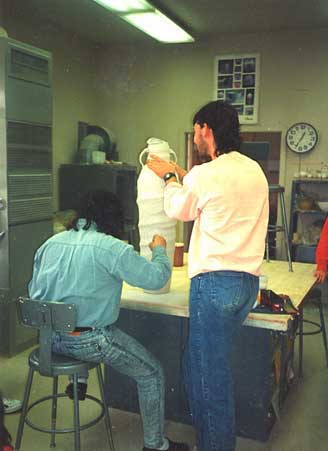
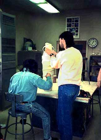
Here are two versions of the picture of Matt and Ah Leon. The top one is just as it resulted from the scanner. The lower one is the result of sending Ah Leon the website URL so he could see the photo. (...and to ask him for more pictures of his work for his page on this site, which he sent - and they are GOOD!) With his return message he returned the photo, which he had doctored in Photoshop. The main difference seems to be that the lower one is darker. NOT BEING VERY KNOWLEDGEABLE about Photoshop, these images are the result of just bumbling around with it right now. Most of the pictures are not "fixed" other than cropping or brightening or improving contrast. For anyone who checks this page, feedback would be appreciated. Which do you like better? Or, can you make any other suggestions? It seems to be mostly a matter of personal preference. The only other fact that impacts the ideas on this is that all of Ah Leon's photos, even of his works in progress, are such good photos. But that could be because he has a really good camera and lens, and he knows how to take the pictures in the first place! |
|||||
 |
|||||